After posting a chalkboard picture on my Facebook page, I was later asked by a 22y old UI design applicant why we’re working on a chalkboards and if the dust isn’t destroying keyboards or Wacom screens – instead of using UX and wireframing tools like UX PIN, Photoshop or Sketch?! Sure, he wanted to demo his skills but after chatting about pros and cons of working analog, it just came to me that the traditional way of sketching wireframes and UX is about to become outdated. Hey, I think it’s fatal to underestimate this way of sketching, especially the sexiness of dried chalk on your hands, the slowdown of the process and emptyness of a white paper.
Let’s summarize this discussion in a longer blogpost including seven of our favorite tools which we use during work in our Wildstyle Atelier.
1. A Chalkboard Helps You To Focus And To Team-Work
Why we love a chalkboard: First it’s the fastest way of outlining a user journey together with the team. Second, you’re focussed (and not disrupted by incoming Facebook chats or e-mails). For me, sketching is probably not the most beautiful but easiest way to get ideas out of my head to start exploring them visually. The chalkboard also helps your team to join you, kill one or two connection lines between interfaces and re-schedule user paths.
Another very underestimated effect is the vertical work on a wall which every co-worker can see and contribute to.
And of course, a whiteboard or huge glass window also helps.
2. Grid Paper And Pen – At A Special Designed UX Desk
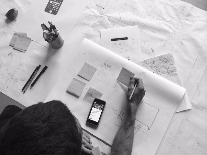
My two most-used tools are besides the chalkboard the pen plus grid paper. I’m a visual person and take a very design-led approach to my UX work. Sketching ideas on paper allows me to visualise and play with different approaches to content structures, interface layout ideas and interactions.
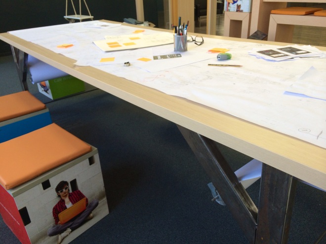
Paper has the property that you can do anything you want. You don’t need to find a checkbox in a dialog you simply draw a checkbox. For the purpose of creating unique UX and UIs, we’ve been designing a UX desk. This 13 feet (4 meters) Long desk has a CAD paper roll beneath. You can simply skip yesterday’s drawings and create a new sketch. Or you rewind the work you did a week ago and finish another drawing. This is pretty old school but a lot of fun for the entire team!
As for pens, I love simple pencils with a rubber but currently favour the Artline 200 pen (fine 0.4mm). A light blue pro marker helps to highlight certain areas of a sketch or wireframe, too.
3. The Sketch App
Certain software tools are, of course, an essential part of our work. They come into play just after we’ve left the chalkboard or the much appreciated “white space” on our office windows.
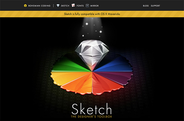
Sketch is an interface design app and it’s intended specifically for designing beautiful user interfaces for a range of devices and screen resolutions (big advantage). Although there are better tools for wire-framing that boast extra features, we’ve been dipping into Sketch to produce quick, great-looking wire-frames.
Sketch is simple and quick to learn. It includes built-in grid controls, linked styles and smart measuring guides. For pixel-perfect obsessives, you’ll love Sketch because it makes the exact art of measuring and aligning elements very easy.
4. MindNode Pro
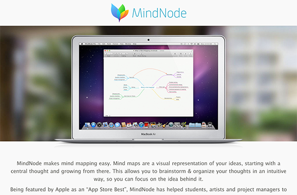
MindNode is a visual, mind-mapping tool that’s very easy to use. It’s available for Mac, iPhone and iPad, and when used in conjunction with iCloud or Dropbox, means you can access your maps from anywhere.
Mindmaps helped us develop a broader feature Roadmap and to oversee the amount of work we’ll have to put into the entire picture. It’s not necessarily a pure UX tool but it belongs to a UX designer’s atrium.
5. Balsamiq: Wireframing And Mockups
I’ve asked my team, our designers and freelance developers about their opinion and favorite UX tool. They all replied with the same answer. It seems like there’s a consensus across the entire industry about Balsamiq – a tool to communicate complex ideas before spending endless hours polishing them.
6. PowerPoint? Yes, PowerPoint!
When I worked for Microsoft and started sketching ideas, wireframes and even user Interfaces, I got trapped in PowerPoint. This was ten years ago when there were only a few UX and wireframing tools available. PowerPoint helps you to outline simple user journeys. You can even draft a UI with PowerPoint’s simple shapes and fiducial axes.
The problem with highly specialized tools is that they tend to make the designer behave like a programmer wiring up pages with links and actions. The wireframe is not meant to be a working prototype. It’s meant to be fluid presentation of the high level application structure.
Download free wireframe templates for PowerPoint here.
7. PostIt Notes During Workshops And Meetings
Well, you shouldn’t really promote this way of creating your UXs with Post Its but to be honest: It’s quick and easy during a workshop with your team. Even with your design team. I’m sure they’ll appreciate it.

